
How We Designed Felly: The Mentorship Platform That Removes Barriers
uipirate
1 views · 20 min read
20 min read | 1 months ago
We designed a mentorship platform that had to feel like a conversation — not a marketplace.
The founder came to us with a frustration, not a feature list.
The frustration was this: the people who need mentorship the most are usually the ones who can't access it. Quality guidance — real, experienced, relevant advice — is locked behind personal networks, expensive programs, or luck. If you didn't go to the right school, work at the right company, or know the right people, finding a mentor who actually understands your situation was nearly impossible.
Felly was built to fix that.
Not as another expert marketplace where you browse profiles like products. Not as a LinkedIn feature buried inside a social network. But as an intelligent platform that understands what you need, connects you with someone who's been there, and makes the entire experience feel like it was designed around you.
The tagline was simple: Share. Connect. Grow.
The challenge was making the product feel as simple as those three words.

"The founder didn't want to build a marketplace. He wanted to build a place where asking for help felt easy."
Why most mentorship platforms fail
Before designing anything, we needed to understand why mentorship products historically underperform.
The market isn't empty. There are platforms for finding mentors, booking sessions, connecting professionals. Most of them struggle with the same problems — and they're not the problems you'd expect.
The mentor side is broken first
Here's something most people don't think about: the hardest part of building a mentorship platform isn't finding mentees. It's keeping mentors.
Experienced professionals are busy. They have limited patience. If your onboarding takes twenty minutes and asks for a headshot, a bio, a video introduction, expertise categories, availability configuration, and payment setup — they'll close the tab at step three.
Most platforms lose mentors before they ever gain mentees.
Mentees don't know what they need
The second problem is subtler.
A mentee signs up because they want "career growth" or "business advice" or "clarity on their next move." But when the platform asks them to select a category, choose a topic, and write a detailed description of what they want to discuss — they freeze.
Not because they're inarticulate. Because mentorship needs are often fuzzy. People know they need help. They don't always know how to label it.
Platforms that demand precision from users who are still figuring things out create a mismatch between the experience and the emotional reality.
Matching is lazy
Most platforms match mentors to mentees using static categories. You say you're in "marketing," you get shown marketing mentors. You say you're in "startups," you get startup mentors.
But real mentorship needs are more nuanced than that. A fashion entrepreneur doesn't need the same mentor as a SaaS founder, even though both might check "entrepreneurship." A junior designer looking for portfolio feedback has nothing in common with a design director navigating organizational politics — even though both would select "design."
Category-based matching creates the illusion of relevance without the substance of it.
Everything feels transactional
The biggest philosophical problem: most mentorship platforms feel like buying a service. Browse experts. Check prices. Book a slot. Pay. Get advice. Leave a review.
That's a transaction, not a relationship.
And mentorship — real mentorship — is built on understanding, context, and trust. If the platform doesn't create space for those things, it's just Calendly with career advice.

What the founder wanted, and what that actually meant
The founder's vision was clear in spirit but complex in execution.
He wanted Felly to feel:
Human, not algorithmic
Approachable, not corporate
Intelligent, not gimmicky
Minimal, not sparse
Guided, not controlling
He also had a strong opinion that I think shaped the entire project: AI should be invisible. The platform should use artificial intelligence — for matching, for expertise generation, for recommendations — but the user should never feel like they're talking to a machine. The humans are the product. The AI is the plumbing.
This created an interesting design tension. We had to build AI-powered features that felt hand-curated. Technology that felt like intuition. Automation that felt like attention.
"The founder kept saying: 'I don't want users to feel like they're being processed. I want them to feel like they're being understood.' That sentence guided more decisions than any wireframe."
The decision that changed the project
Most teams would have started with the marketplace. Build the mentor discovery page. Design the search. Create the profiles. Ship it.
We didn't.
We started with onboarding.
The founder identified — correctly, as it turned out — that onboarding was the single most important experience in the entire product. Not discovery. Not booking. Not payments. Onboarding.
The logic was straightforward:
If you don't understand your users deeply during onboarding, everything downstream suffers. Your recommendations are generic. Your matching is shallow. Your mentors receive unprepared mentees. Your mentees feel overwhelmed by irrelevant options.
Onboarding wasn't just a first impression. It was the foundation that every other feature would be built on.
So we spent the entire first phase designing nothing but the onboarding experience.

Designing two onboardings, not one
One of the earliest and most important decisions: mentors and mentees get completely separate onboarding experiences.
This sounds obvious. It wasn't.
The initial assumption was that a single flow with branching logic could serve both — "Are you a mentor or mentee?" at step one, then a shared path with role-specific questions mixed in.
We killed that idea quickly.
Mentors and mentees are fundamentally different people with fundamentally different motivations:
Mentors are giving their time. They want:
A fast, respectful setup process
Control over their availability and pricing
Credibility signals that reflect their experience
Confidence that they'll receive prepared, relevant mentees
Mentees are seeking help. They need:
Guidance through ambiguous goals
Reassurance that the platform understands them
Low-pressure exploration, not interrogation
Confidence that they'll be matched with someone relevant
Forcing these two mindsets through the same funnel would have compromised both. A flow optimized for mentor speed would feel cold to mentees. A flow designed for mentee exploration would feel tedious to mentors.
So we built two entirely independent journeys.
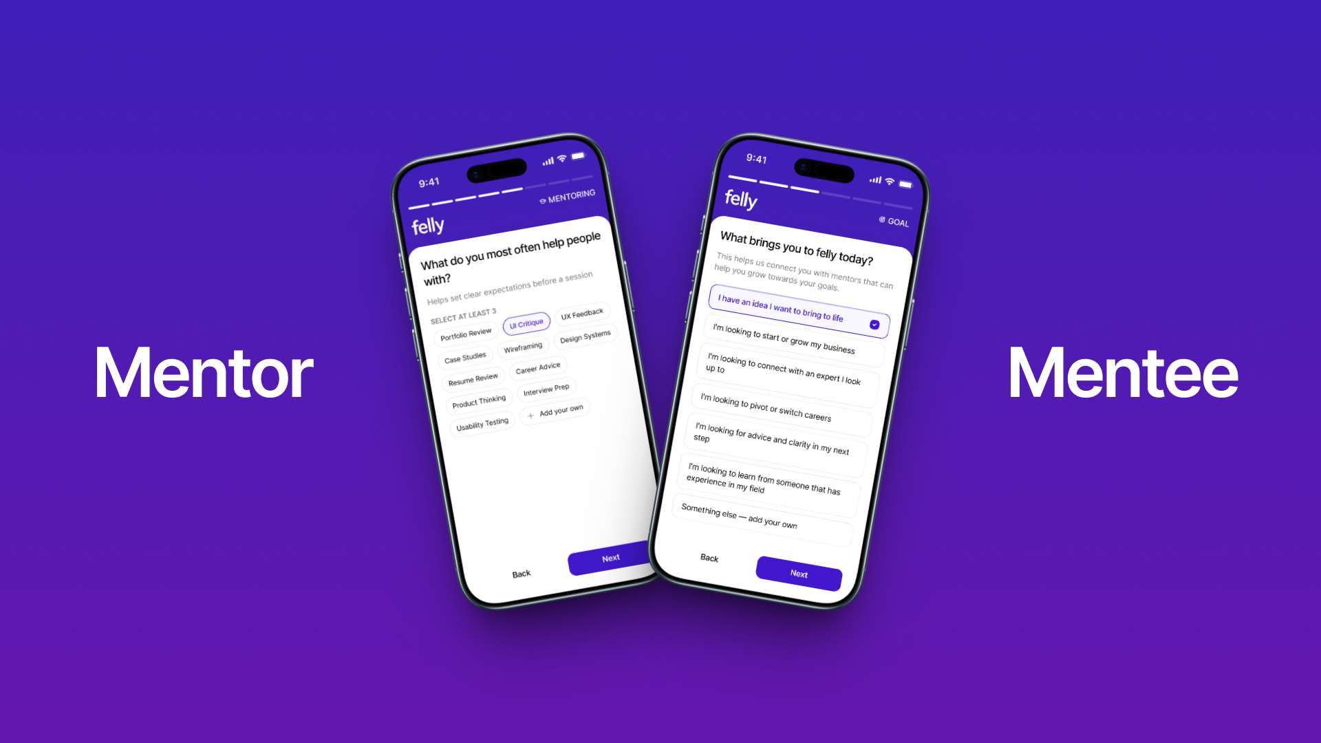
The mentee onboarding: understanding before matching
The mentee onboarding was designed around a single principle: one question at a time.
No scrolling forms. No multi-field screens. No "fill in your profile" dashboards. Just a conversation — one question, one answer, then the next.
This wasn't just an aesthetic choice. It was a cognitive load decision.
When someone is trying to articulate what they need help with — and they're not entirely sure themselves — throwing a wall of fields at them creates anxiety. They freeze. They overthink. They abandon.
One question at a time reduces the pressure. Each answer builds on the last. The experience feels progressive, guided, almost conversational.
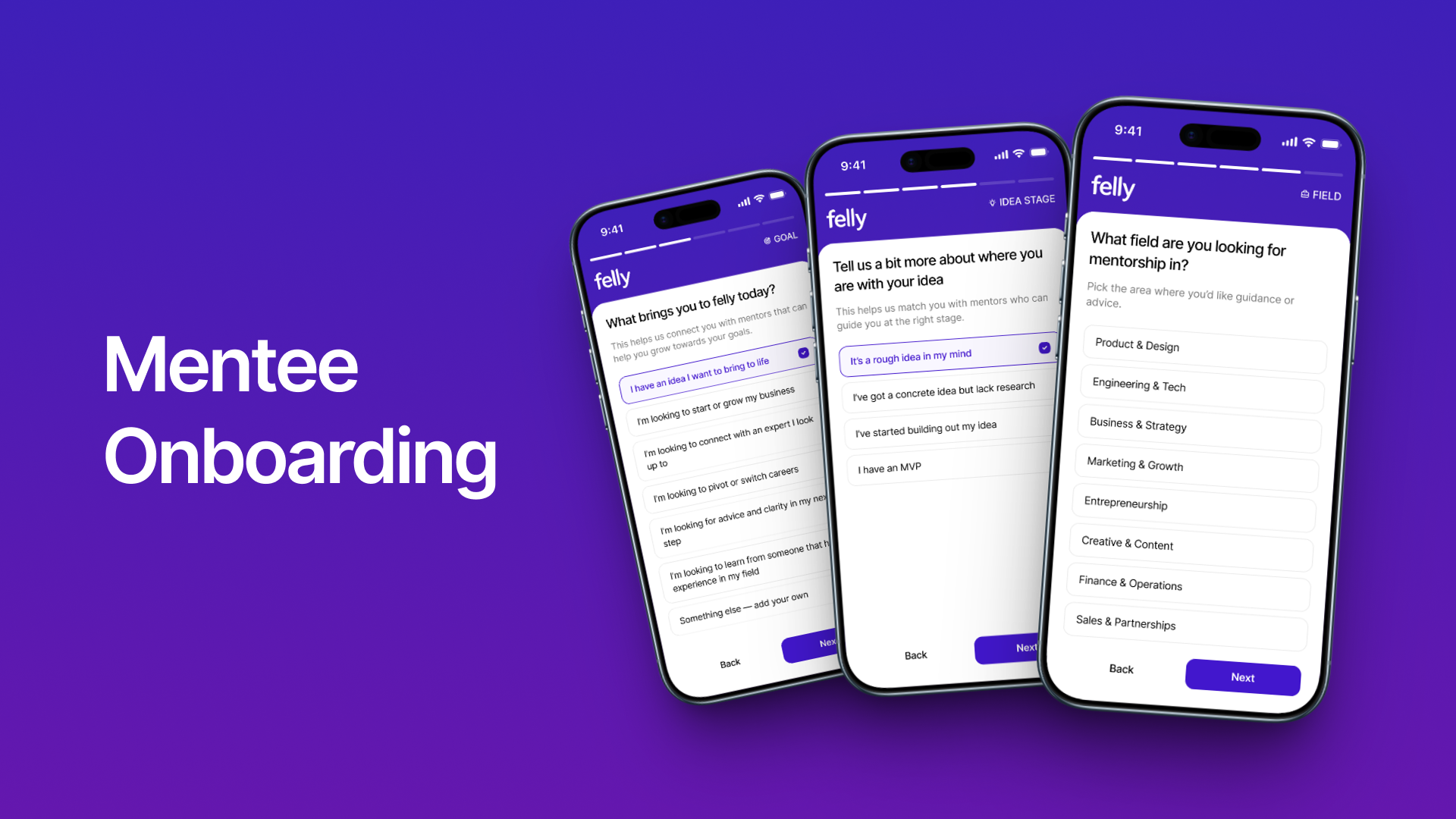
What we asked, and why
Every question in the mentee onboarding was there for a functional reason. Nothing was decorative.
"What brings you to Felly?" Not a dropdown. Not a multi-select. A set of clear, tappable options, career growth, business advice, skill development, clarity, networking. This immediately segments the user's intent without requiring them to articulate something complex.
"What field are you in?" Contextualizes everything downstream. A product manager seeking mentorship needs different guidance than a first-time founder.
"What stage are you at?" Early career, mid-career, transitioning, exploring. This determines the type of mentorship needed — tactical, strategic, exploratory, or supportive.
Each answer quietly shaped the experience that followed. The user didn't see the algorithm working. They just felt like the platform was paying attention.
What we removed
Equally important was what we didn't ask.
No profile photo required. Making a photo mandatory during onboarding adds friction and creates a psychological barrier for users who aren't ready to commit.
No LinkedIn import required. Offering it as an option — yes. Requiring it — never. Some users don't want their mentorship activity connected to their professional identity.
Minimal open-ended text fields. Every free-text question was a risk point for abandonment. We replaced most with tap-to-select interactions.
No "describe your goals in detail" upfront. Users can barely describe their goals to themselves. We gathered this information progressively, across multiple interactions, not in one exhausting form.
"We measured onboarding quality by what we didn't ask, not by what we did."
The mentor onboarding: respect their time
Mentors are the supply side of the platform. Without great mentors, nothing works.
And great mentors — experienced, busy, successful professionals — have approximately zero patience for complicated setup flows.
The mentor onboarding had one design objective: get them set up in under five minutes without feeling rushed.
This meant:
Only essential information upfront
Everything else configurable later
Clear value shown at every step ("here's what mentees will see")
No ambiguity about what happens next
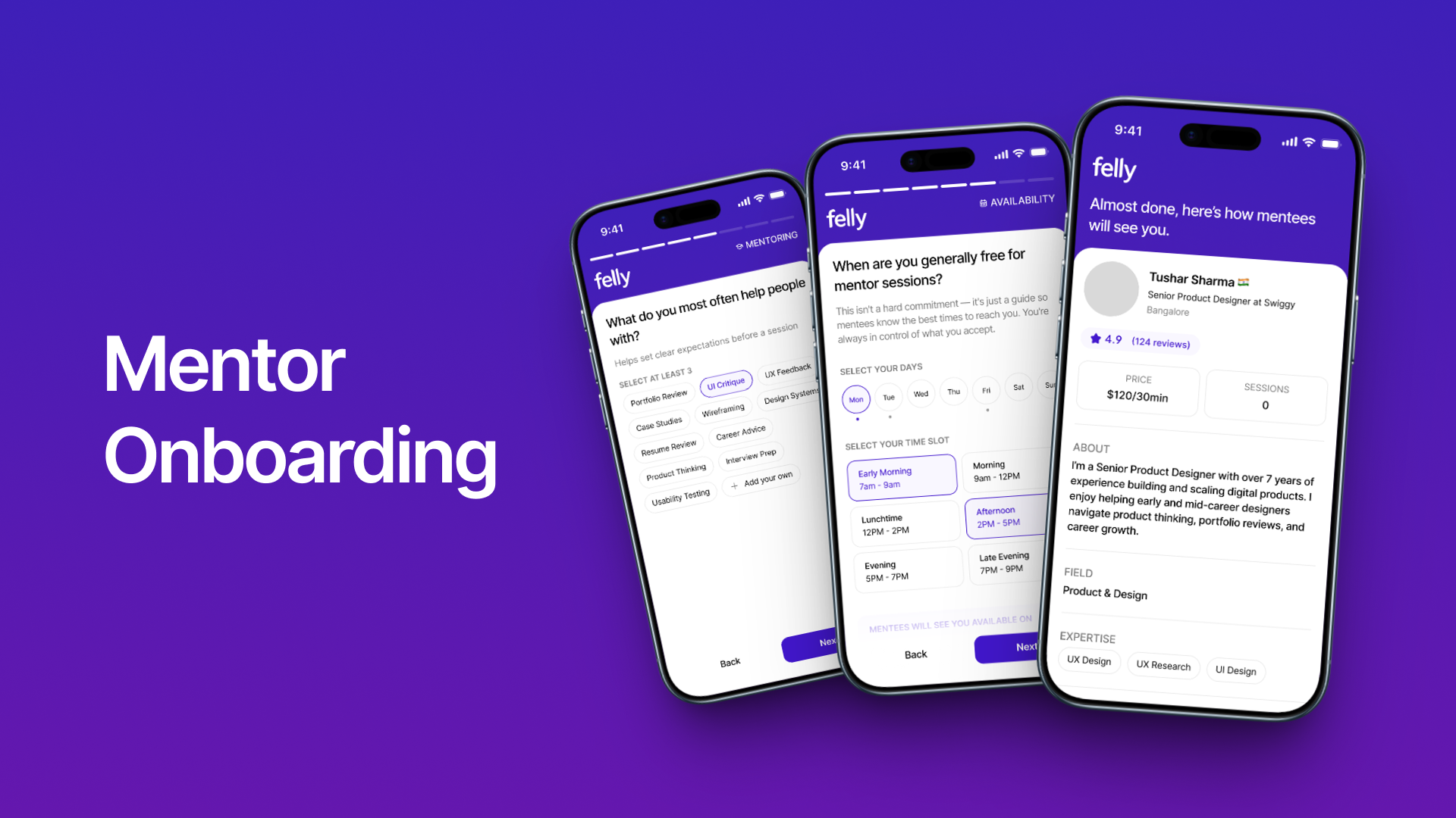
The AI expertise breakthrough
The most innovative part of the mentor onboarding — and honestly, one of the most interesting design problems in the entire project — was the expertise system.
Traditional platforms force mentors into predefined categories. Pick "Marketing" or "Leadership" or "Product Management" from a dropdown. This is fast to build but terrible in practice. Real expertise doesn't fit neatly into boxes.
A fashion entrepreneur who's scaled a D2C brand, negotiated with manufacturers, built a social media presence, and managed international logistics has expertise across a dozen domains. Forcing them into "Entrepreneurship" loses all the nuance.
We designed an AI-powered expertise generation system.
Here's how it worked:
The mentor enters their field and role
The system generates relevant expertise suggestions dynamically
The mentor selects, edits, or adds to the suggestions
The selected expertise areas become their profile tags and matching criteria
A SaaS founder gets suggestions like: product-market fit, fundraising, B2B sales, team building, pricing strategy.
A fashion entrepreneur gets: brand development, D2C operations, supply chain, influencer marketing, retail strategy.
Same question. Completely different outputs. Because the system understood context, not just categories.
This did two critical things:
It made mentor profiles significantly more accurate and detailed
It dramatically improved mentee-to-mentor matching downstream
"The moment a fashion entrepreneur saw 'supply chain management' and 'brand storytelling' appear as suggested expertise — without typing either — we knew the AI approach was working."
Phase 2: Building the full platform
Once the onboarding foundation was validated, we expanded into the complete platform experience.
This was where the project transformed from an onboarding exercise into a full product design engagement — mentor apps, mentee apps, web platform, dashboards, booking flows, session management, earnings, reviews, and everything in between.
The mentee experience
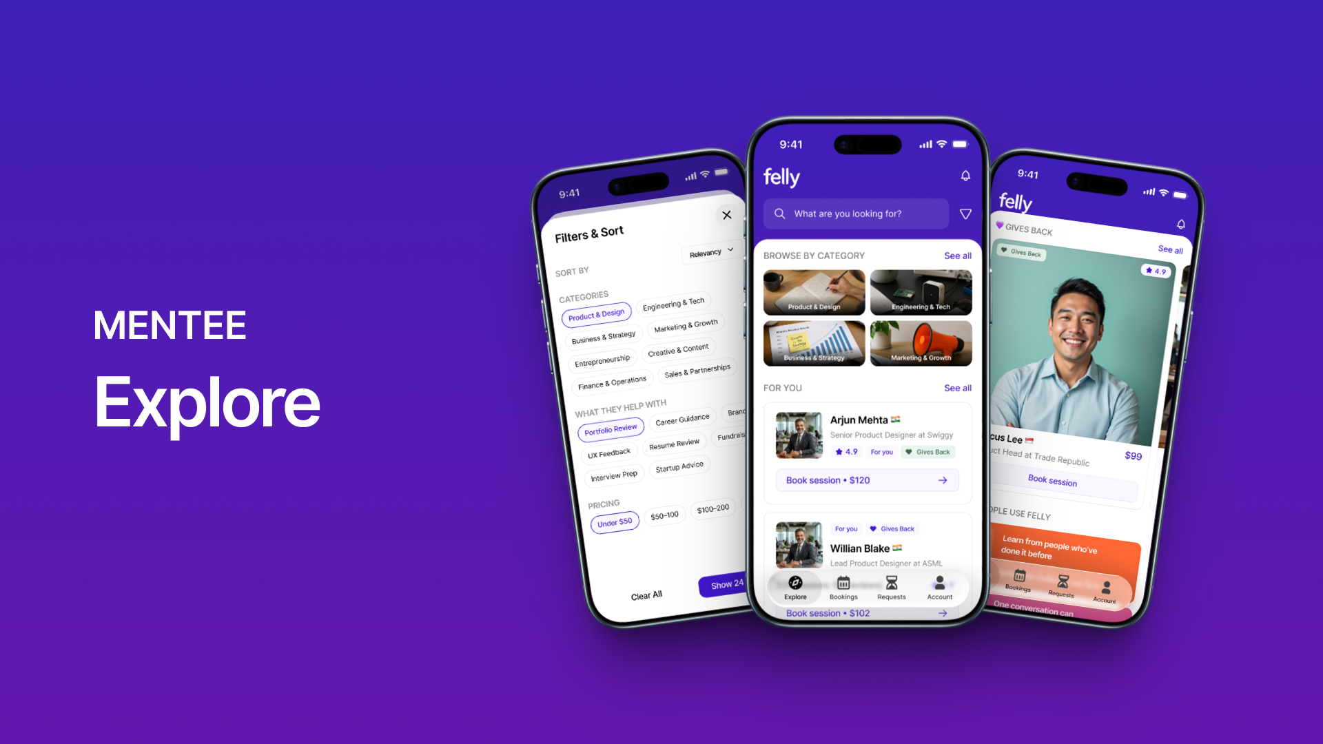
Discovery that feels curated, not overwhelming
The mentor discovery screen was the most important surface in the mentee experience. Get it wrong, and mentees feel lost in a crowd. Get it right, and they feel like the platform handpicked options for them.
We designed discovery around layers:
Personalized recommendations appeared first — mentors matched based on the mentee's onboarding data. These weren't generic "top mentors." They were contextually relevant to the individual user's goals, field, and stage.
Category browsing offered structured exploration for users who wanted to look around. But categories weren't flat lists — they were organized by intent (career transitions, skill building, business growth) rather than industry labels.
"Gives Back" mentors got dedicated visibility. Mentors who donated portions of their earnings to charitable causes were surfaced as a distinct section. This reinforced Felly's ethos without making it feel like a marketing message.
Top-rated mentors provided social proof for users who wanted reassurance.
The discovery experience was designed to feel like walking into a well-organized library — not a warehouse.
Mentor profiles that build trust in thirty seconds
A mentee deciding whether to request a session is making a trust decision. They're trusting this stranger with their time, their money, and their vulnerability.
The mentor profile had to compress trust-building into a single scroll.
Every element earned its position:
Expertise tags — immediately answering "can this person help me?"
Experience summary — establishing credibility without being a resume
Reviews and ratings — social proof from people who've been in their shoes
Availability indicator — removing the "are they even active?" uncertainty
Session pricing — transparent, upfront, no surprises
Response time — setting expectations for how quickly mentors engage
Charitable contributions — adding a human dimension beyond credentials
Session count — demonstrating platform commitment and reliability
We deliberately avoided long bios. Mentees don't read paragraphs when they're evaluating options. They scan signals. The profile was designed for scanning.
Context before conversation
This was one of the strongest UX decisions in the entire project.
Most platforms let you book a mentor the way you'd book a haircut. Pick a time. Show up.
We designed the opposite: every session request includes context.
Before a mentee can book, they provide:
Why they chose this specific mentor
What topics they want to discuss
Specific questions they'd like to explore
This created a fundamentally different dynamic:
For mentors: they arrive prepared. They know what the mentee needs. They can provide better guidance because they're not spending the first ten minutes figuring out what the conversation is about.
For mentees: the act of writing down their questions clarifies their own thinking. Many users told us that just articulating their goals — even before the session — was valuable.
For the platform: sessions became higher quality, which led to better reviews, which attracted more mentors, which improved the ecosystem.
One design decision. Three beneficiaries.
"We made mentees do a little more work before booking. Counter-intuitive for a marketplace. But the result was sessions that actually meant something."
Session management that doesn't disappear
After a session is booked, most platforms go silent. You get a confirmation email, maybe a calendar invite, and then nothing until the call.
We designed the post-booking experience as an active space:
Request tracking — real-time visibility into whether the mentor has accepted, suggested changes, or declined
Upcoming sessions — a clear view of what's scheduled, with join-call access right where you expect it
Rescheduling flows — because life happens, and changing a time shouldn't require customer support
Post-session reviews — prompted naturally after completion, not buried in a settings menu
Session notes — a space to capture insights while they're fresh
The goal was that a mentee should never have to wonder: "What's happening with my session?"
The mentor experience
We didn't mirror the mentee app and call it done.
Mentors needed a fundamentally different product — one optimized for efficiency, control, and operational clarity. They're not browsing. They're managing.
The mentor dashboard
When a mentor opens Felly, they need to know three things immediately:
What needs my attention right now?
What's coming up?
How am I doing?
The dashboard was designed around exactly those three questions:
Pending requests — front and center. New session requests with mentee context visible at a glance. Accept, decline, or suggest alternatives without navigating away.
Upcoming sessions — a clean calendar view of what's scheduled, with enough detail to prepare without opening each session individually.
Earnings overview — total earned, pending payouts, charitable contributions. Not buried in a settings page. Visible as part of the daily experience.
Quick actions — update availability, adjust pricing, check profile completion. The things mentors need to do regularly, accessible without hunting.
Request management that respects the mentor's judgment
When a mentee requests a session, the mentor receives everything they need to make an informed decision:
The mentee's background
Why they chose this mentor specifically
What they want to discuss
Their specific questions
Proposed timing
This isn't just information display. It's respect.
It says to the mentor: "We value your time. Here's everything you need to decide if this session is worth it — before you commit."
Mentors can:
Accept — the session is confirmed
Decline — with optional feedback (we kept this low-friction; mentors shouldn't feel guilty about declining)
Suggest alternatives — different times, different focus areas, different session formats
This created a two-sided quality filter. Mentees provided context. Mentors evaluated fit. The result was sessions where both sides showed up prepared and motivated.
Earnings and impact
Mentor compensation was designed to feel transparent, not transactional.
The earnings experience included:
Clear rate management — set and adjust session pricing
Real-time earnings tracking — see what's been earned, what's pending, what's been paid
Multiple withdrawal methods — flexibility without friction
Charitable giving integration — donate a percentage of earnings directly through the platform
The charitable component was one of Felly's unique differentiators. Mentors could choose to contribute a portion of every session fee to selected causes. This transformed mentorship from a purely professional exchange into something with social impact.
It wasn't a gimmick. It was core to the brand's identity.
And from a design perspective, it was the rare feature that made users feel good while using it — not just productive.
"Most platforms design earnings pages to feel like bank statements. We designed ours to feel like progress — professional and social."
Design decisions that defined the product
Making AI invisible
This was the philosophical cornerstone of the entire project.
Felly uses AI for:
Expertise generation during onboarding
Mentor matching and recommendations
Profile enrichment
Progressive learning from user behavior
But none of this is visible to the user as "AI."
There's no chatbot. No "powered by AI" badge. No artificial assistant character. No prompt interface.
The AI works behind the curtain. The user sees results — relevant recommendations, accurate expertise tags, increasingly personalized experiences — without ever feeling like they're interacting with a machine.
This was a deliberate choice, not a limitation. The founder believed — and we agreed — that mentorship is an inherently human experience. The moment users feel like an algorithm is mediating their relationships, the emotional quality degrades.
AI makes the platform smarter. Humans make it meaningful.
Progressive profiling over interrogation
Traditional platforms collect everything upfront. Name, photo, bio, experience, skills, goals, preferences, availability, payment method, notification settings — all in one exhausting session.
We designed Felly around progressive profiling: gather the minimum needed to start, then learn more over time.
During onboarding: just enough to understand the user and provide initial recommendations. After first session: prompt for a review, which reveals preferences and satisfaction signals. Over continued use: refine recommendations based on booking patterns, mentor choices, session topics, and review content.
The profile gets richer with every interaction — without the user ever sitting through another form.
This approach has a second benefit: data quality. Information gathered through natural behavior is more accurate than information demanded through mandatory fields. People fill in forms to get past them. They interact with products honestly.
The "one question at a time" philosophy
We used this pattern throughout the product, not just in onboarding.
Session requests: one piece of context at a time. Review flows: one question per screen. Profile completion prompts: one field, one action.
This wasn't about making things feel slow. It was about making things feel manageable.
Every time a user sees a form with seven fields, they unconsciously calculate the effort required. Even if each field takes ten seconds, the perception of effort is high. A single field on a clean screen feels like nothing — even if the total number of questions is the same across both approaches.
Perception of friction matters more than actual friction.
The design system
Felly's design system reflected its personality: warm, minimal, confident, and human.
Visual language
The visual direction avoided two common traps:
Trap 1: Looking like a corporate HR platform. Mentorship touches career development, which is one design decision away from looking like enterprise HR software. Grey tables. Blue buttons. Form-heavy layouts. We consciously avoided this.
Trap 2: Looking like a lifestyle app. The other extreme — overly playful, gradient-heavy, illustration-saturated designs that prioritize personality over usability. Mentorship is serious. The design needed to respect that.
Felly landed in the middle: modern, clean, warm, and purposeful. Every visual choice served clarity and trust.
Typography
Clean, modern, highly readable. Optimized for mobile-first experiences where text sizes vary dramatically and reading contexts range from quick scanning to focused content consumption.
Color
The palette was designed to feel:
Welcoming without being childish
Professional without being corporate
Distinctive without being noisy
Color was used functionally — status indicators, action hierarchy, categorization — not decoratively. In a product where trust matters, visual restraint communicates reliability.
Components
Key components built for the system:
Mentor cards. The most repeated element in the product. Each card compressed identity, expertise, rating, pricing, and availability into a compact, scannable unit. We iterated on these extensively — the balance between information density and visual breathing room took several rounds.
Session cards. Different from mentor cards. These tracked state — pending, confirmed, completed, reviewed — and each state needed to communicate both status and next action.
Request flows. Multi-step, one-question-at-a-time sequences with consistent transition patterns, progress indicators, and back-navigation that preserved entered data.
Review components. Star ratings, text feedback, and tag-based highlights — designed to be fast for users who want to leave a quick rating and accommodating for users who want to write detailed feedback.
Earnings components. Charts, transaction lists, and payout status — designed to feel clear and trustworthy, because money-related interfaces have zero tolerance for ambiguity.
What was harder than expected
Balancing mentee guidance with mentor autonomy.
The more we guided mentees — through onboarding, through discovery, through session requests — the more structured their experience became. But structure on the mentee side created expectations on the mentor side. If a mentee provides detailed session context, the mentor feels obligated to deliver detailed preparation. Some mentors loved this. Others felt it added pressure to what should be a natural conversation.
We landed on a compromise: mentee context is visible but framed as "conversation starters" rather than "session requirements." The language mattered. A lot.
Making "Gives Back" feel genuine, not performative.
The charitable mentorship feature was a brand differentiator. But there's a thin line between genuine social impact and corporate greenwashing aesthetics. If the design over-promoted charitable giving, it would feel like a marketing play. If it under-promoted it, the feature would go unnoticed.
We embedded it naturally — visible on mentor profiles, present in earnings dashboards, acknowledged in session summaries — without dedicated landing pages or promotional banners. The feature existed as part of the experience, not on top of it.
Designing the decline experience.
When a mentor declines a session request, the mentee is disappointed. This is inevitable. But how that decline is communicated changes whether the mentee tries again or leaves the platform.
We went through four versions of the decline flow:
Simple "declined" notification — too cold
Decline with mandatory reason — too burdensome for mentors
Decline with suggested alternatives — better, but complex to implement
Decline with optional context + platform-suggested similar mentors — this is where we landed
The decline became a redirect, not a dead end. "This mentor isn't available, but here are three others who match what you're looking for."
Making session reviews feel worthwhile.
Review fatigue is real. Every app asks for reviews. Most users ignore the prompt.
We made reviews feel reciprocal rather than extractive. After a session, the review prompt framed feedback as: "Help this mentor understand what was most valuable." Not "rate your experience." The language shifted the act of reviewing from evaluation to contribution.
Completion rates for reviews were designed to be significantly higher than typical marketplace benchmarks — because the prompt felt like a continuation of the mentorship, not an interruption after it.
Reflection
Felly was a different kind of project for us.
Most of our work involves complex enterprise systems — dense information, technical users, operational scale. Felly was the opposite: a human product, designed around emotions, trust, and personal growth.
But the design thinking was remarkably similar. Understand the users. Map the workflows. Find the friction. Remove the unnecessary. Make every decision intentional.
A few things this project reinforced:
Onboarding is product strategy, not just UX.
The decision to build onboarding first — before marketplace, before matching, before sessions — was the smartest strategic choice in the project. Everything downstream improved because the foundation understood users deeply. Most products treat onboarding as a funnel to optimize. Felly treated it as a relationship to begin.
AI works best when users forget it's there.
The invisible AI approach made Felly feel hand-curated rather than algorithmically generated. Users didn't praise the AI. They praised the recommendations. That's exactly how it should work.
Two-sided platforms need two-sided design.
You can't design a marketplace from one side. Mentor friction matters as much as mentee satisfaction. Mentor decline experiences matter as much as mentee booking flows. Every feature has two audiences, and both need to feel respected.
Removing features is harder than adding them.
Half of the onboarding improvements came from cutting questions, not adding them. Making the profile photo optional. Making LinkedIn import optional. Replacing text fields with tappable selections. The instinct is always to gather more data. The discipline is knowing when less data creates a better experience.
Language is design.
In a product about human connection, every word matters. "Session requirements" vs. "conversation starters." "Rate your experience" vs. "Help this mentor understand what was valuable." These aren't copywriting decisions. They're design decisions that shape how users feel while using the product.
What Felly became
Felly evolved from an onboarding concept into a complete mentorship ecosystem.
A platform where mentees can find relevant mentors without knowing the right keywords. Where mentors can share their experience without drowning in administrative overhead. Where every session starts with context and ends with reflection. Where AI makes things smarter and humans make things meaningful.
Not a marketplace.
A meeting ground.
Personalized Help
Struggling with How We Designed Felly: The Mentorship Platform That Removes Barriers? Let's talk about your product.
UI Pirate is a product design & development agency trusted by 50+ SaaS founders and enterprise teams across the US, UK & beyond. Tell us what you need.
More to Read
All articles → conversational-ai
Designing NxVoy: Redefining the Flight Booking UX with Conversational AI
We designed a travel platform where users could say "Book a 3-day Dubai trip for 3 people" and actually get a bookable result — with flights, weather, visa info, and local tips — instead of a search form.
 case-study
Designing ConnectWise: How We Solved Complex Operations and Event Engagement in One Ecosystem
We designed two products for the same organization — an AI-powered support operations platform and an event networking app — and made them feel like one ecosystem.
 ux case study
Fixing a Broken Rental Lifecycle: A Multi-Product UX Case Study
How we designed StayPe, a connected four-product PropTech ecosystem unifying tenants, brokers, and landlords across the rental journey.